Fitts's Law and wormy Apples
If Apple were taking an elementary interaction design class, it would fail.
That quote is there only as a content advisory, but the source might be surprising: Donald A. Norman and Bruce Tognazzini, responsible for much of Apple's original user interaction design.
My first experience of Apple was while working for a company where a manager offered to get a MacBook Pro for anyone who wanted one. I was happy with my Linux machine, but he gave me one anyway.
Up to then, I would have said this: I have nothing against Apple's products, I just dislike the idea of paying to work in a garden owned by a corporation which compels me to buy my hoes and forks from the company store, which might ask me to move to another of its plots sooner than I would wish, and where I can sell the produce I grow only to those who also pay tribute to the same corporation. I lean towards being a freeholder.
But that leaning had been rendered irrelevant, so when the MacBook Pro arrived I was curious to discover what inspires such brand devotion among Apple fans. With a "Maserati for the mind", would I now join that class of people who cycle to the office with a dog at sunrise and finish work before breakfast?
Over the following days, however, Mr Macintosh extinguished any hope that he would be an amenable servant. He might have looked well with his white gloves and coat tails and impeccably flowing pixels, but he gave the impression of someone inflated by the knowledge of just how much had been paid for his services, and with very fixed ideas about how he would perform them. Here was a butler who might iron a newspaper, but only one he approved of.
The first minor issue was the MacBook's lack of ports, which delayed me until I could accessorize it. The next question was what to do with that curious touch bar. I won't call it a gimmick, but I soon found that, although MacOS allowed me to enable "sticky keys", the touch bar was oblivious to this setting: as soon as my finger was lifted from 'Fn', the ephemeral function keys disappeared again. It seems Apple's touchy people don't talk to their sticky people.
A greater nuisance was the ceremonious copy-and-paste. On a Linux desktop, I can do this quickly one-handed by dragging the mouse over text and then double- or middle-clicking to paste what I last selected. With Apple, to copy and paste involves steps that alternate between the keyboard and the pointing device. Even using two hands, that could be annoying if you have your mouse on the left, that being the side of the keyboard with the 'C' and 'V' keys.
When I assigned the MacBook the light duty of keeping a VM alive, it kept nodding off, taking the VM with it. It was plugged in and the "stay awake" or "disable sleep" box was ticked. Or maybe it was an "enable sleep" box that was unticked. Either way, I searched all the settings for a possible cure for its narcolepsy, but in vain.
After some weeks of accumulated vexations, I began to consider installing Linux on the MacBook. That might not have worked well and it would not have pleased the company that owned it, so I decided against it. However, the idea led me to try the MacOS disk partitioning function, where I encountered a poor design and multiple bugs. I asked a colleague who was a long-time Apple user whether this was the worst partition editor ever made. He offered no defence, other than that they weren't trying: "Oh, yeah. They don't care about that. They'll probably remove it from a future release. No, they don't care about you."
But I want to return to mere irritations, one in particular: the menu of the active window being at the top of the screen in the Apple menu bar instead of being attached to the window. Before I go further, there is a positive usability motivation for doing things the Apple way. It's based on Fitts's Law.
Fitts's Law
Imagine you have to reverse your Lamborghini up a driveway and into a garage only slightly longer than the car. (Maybe you have someone who does that for you, but just imagine.) Briefly, Fitts's Law is the observation that two things contribute to how long that takes: the length of the driveway and the small size of the parking space.
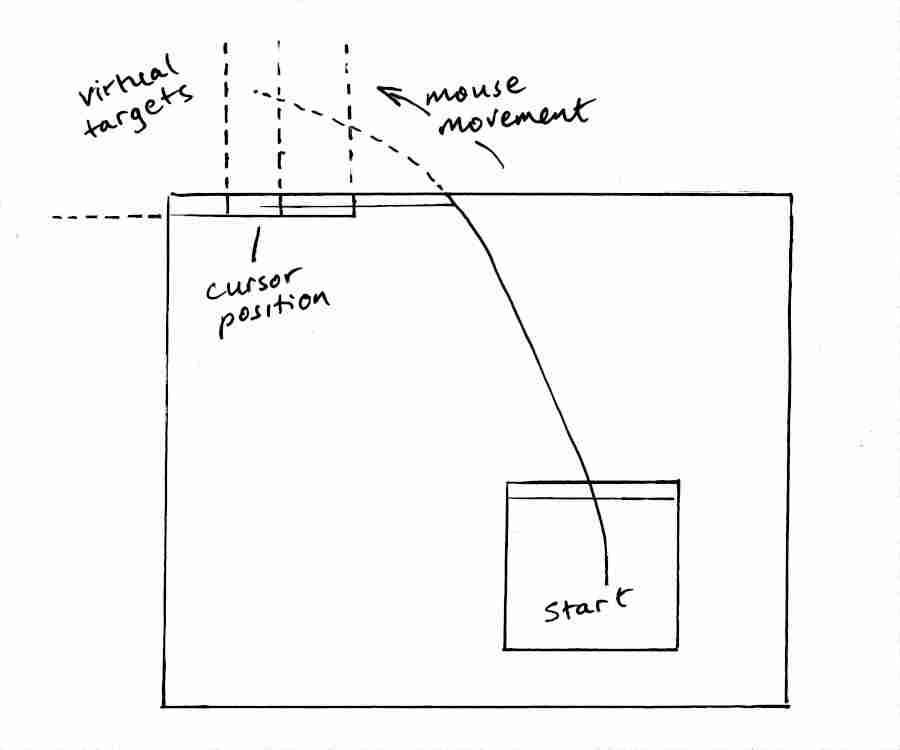
On an Apple computer, if your active window is near the bottom of the screen then having that menu bar at the top edge is like having a long driveway. Which should mean that it takes longer to move the cursor to the menu. However, that cursor is not an expensive Lamborghini, it's a fairground bumper car. That means you can safely aim for anywhere beyond the garage wall and move there at full speed. In other words, putting a small menu button at the screen edge makes it a much larger virtual target. And being able to drive a bumper car at a wall without braking more than compensates for the wall being farther away.
That's all very well in theory. Actually, in practice too: Fitts's Law has been tested and proven in many different contexts (possibly not with Lamborghinis). It's a simple model, even common sense. But any model can be misapplied.
Caveats
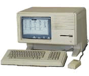
There are at least two issues to consider when using Fitts's Law as a justification for putting the application menu at the top of the screen. First, Apple's menu bar made its debut in the 1983 Apple Lisa, which had a screen just 364 pixels high. That doesn't mean that the menu bar is broken on modern screens, but, as Bruce Tognazzini has acknowledged, it "presupposes a properly designed acceleration function for the mouse."

A mouse might not be convenient in a lab or other environment where you want to move your MacBook around and put it down wherever is handy. Or even on an office desk temporarily shared with a Linux machine, leaving insufficient room for a mouse to take a run at the screen boundary. Using the touchpad instead might still be a bit like driving a bumper car, except that on longer journeys you have to get out halfway to give it a push.
If the menu bar's usability depends on the circumstances then wouldn't it be good to make it configurable? Retain the menu bar but also allow for in-window application menus for those who, for whatever reason, find them faster to reach. Of course, that's whistling in the wind because Apple has a different solution that works for them: buy an iPad to complement your MacBook.
But even assuming that you have a mouse, or that you can drive your touchpad just as well as one, another question arises. Suppose, after reading about experiments comparing menu positions, you decide to check for yourself the objective difference between using the menu bar and an in-window menu. You place the cursor at some agreed representative starting position, wait for the green light from the race marshal, and shove your mouse forward sharply. Perhaps you need to make a small lateral correction when your bumper car hits the screen edge, but that's quick too.
Stop the clock!
That was fast. Based on that article you read, you've got a chequered flag and your time is up on a board.
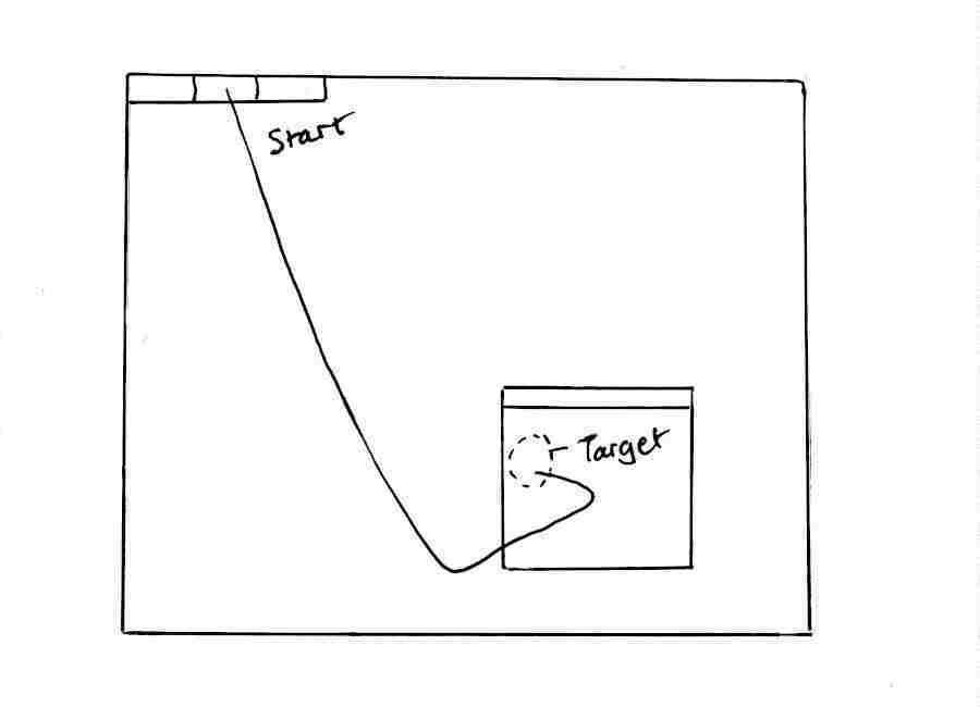
In a realistic scenario, however, the next thing you are likely to do is move the cursor back to a target within the application window. That return journey is not to a screen edge, so now you have to brake and swerve. And it's a longer drive than the one from an equivalent in-window menu, so it counts. There's another lap in the race.
I emailed someone who had done experiments finding that the menu bar was faster to use than alternative menu types. Had he considered the return journey and merely neglected to mention it? What was the fairest way to account for it? He replied, but without answering the question.
For me, Apple season had already passed, and I did not pursue this further. Brief points:
- A distant menu in the case of a limited pointing device has a cost that exceeds the benefit of having a large virtual target in the case where the device has greater natural reach.
- Users and circumstances differ. It should not be assumed that the user has a good pointing device, or that a trackpad as fallback can be configured to work equally well.
- Subjective experience matters. Two Apple-using colleagues did not mention Fitts's Law or speed of menu acquisition when I asked whether they liked the menu bar. If, with a mouse, it takes me a little longer to navigate to a menu not at the screen edge then that doesn't seem to distract me (after all, most targets are not at the screen edge anyway), whereas Apple's two-handed copy-and-paste annoyed me intensely. A mounting feeling of frustration may impair productivity more than any measured time penalty on an individual action.
- A menu separated from its window violates the principle of placing related things together, where you would expect them to be. This consideration may rank lower than others, but it should have a non-zero weighting. Consider also scenarios such as making a screencast of all user interactions with an application by recording what happens within the window.
- Fitts's Law is real, but it is validly applied only when all factors are included in the formula. And placing menus exclusively at the screen edge is not the only way to exploit it.
Notes
The quote at the top is from Norman and Tognazzini's 2015 article How Apple Is Giving Design A Bad Name. (The specific faults mentioned here differ from theirs: there are enough to go around.)
My MacOS experience was in 2021 and doesn't reflect any bug fixes since then.
As evidence that I'm not uniquely eccentric, at least one other person has wanted to move the MacOS menu bar to the application.
An exploratory study from 2006 using subjects with physical impairments: Factors Influencing User Performance with Pointing Devices.
"Cycle to the office with a dog..."? Like Kevin Costner. He's on Youtube, with Lisa.
The Apple Lisa image is from Steven Stengel.

